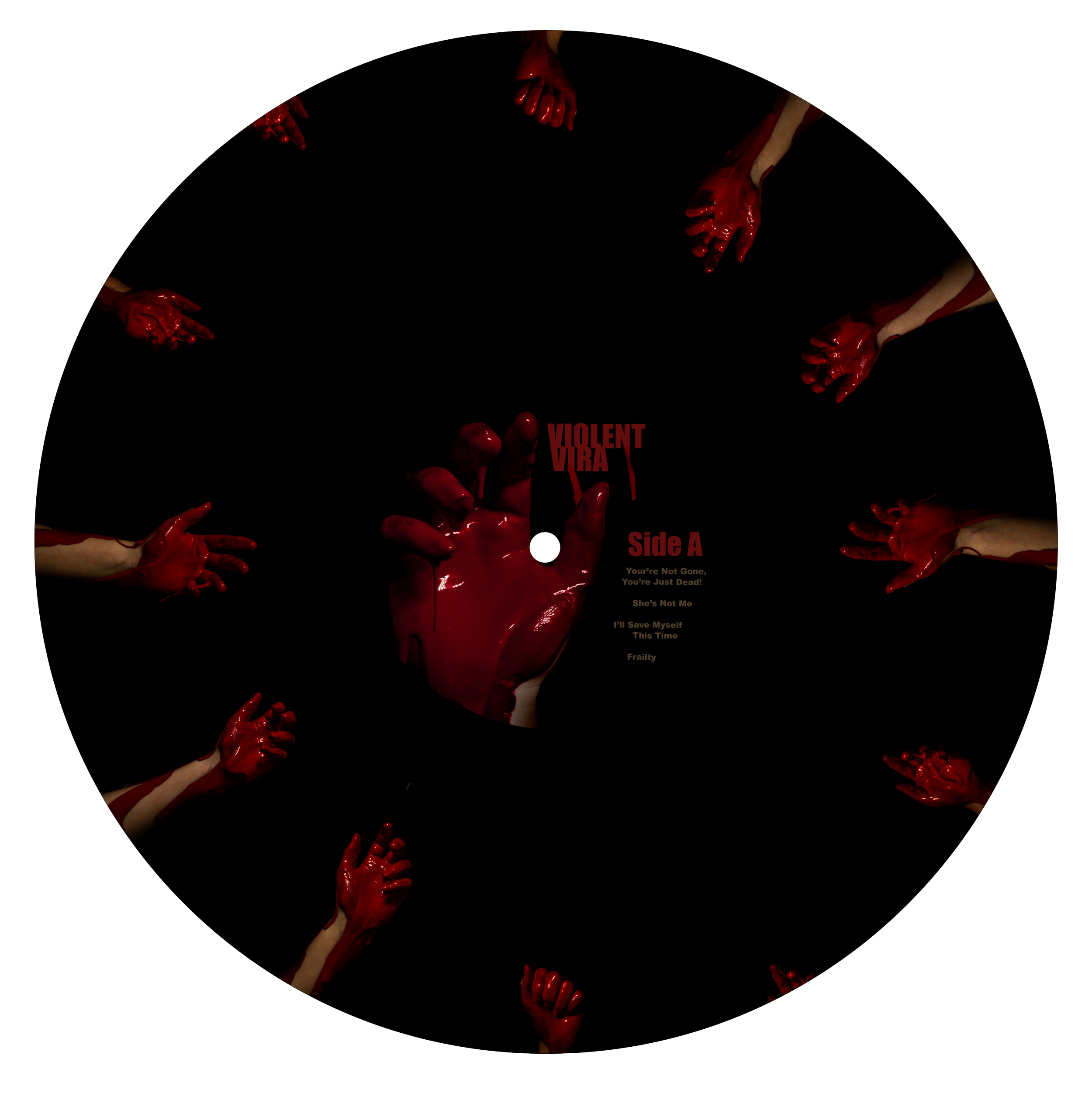
This is by far my strongest work, effectively using color, balance, hierarchy, typography, and composition to create a cohesive theme for the album cover that perfectly matches the artist's style. The original photography, crafted through a combination of paint and digital editing, allowed me to capture the exact scene I envisioned for the project. With Photoshop, I was able to refine the images, adding extra drips or repositioning them to other parts of the design for more visual impact.
Color played a crucial role in this design. The blood-red title stands out sharply against the black background, but to make it pop even more, I incorporated the greenish-yellow hues found in the leaves. This contrast not only enhances the legibility of the text but also helps the title command attention.
The composition is intentionally balanced to ensure the design feels full but not overcrowded. The dark background serves as a perfect void, allowing the photos to emerge with clarity and focus.
This project didn’t through many major drafts. It came Together quick quickly once the idea was created and the photographs were taken and edited. The hand and flower are both original photographs taken by me. Using red paint and a solid background most if the work was done in Adobe Lightroom. With simple masking it was able to give it a black background and edit the hand or flowers and create a drastically different image.


